• Work
    • Professional Work
    • Mixed Media
  • About
  • Blog
Jen Donohue - Product Designer
  • Work
    • Professional Work
    • Mixed Media
  • About
  • Blog

Daily UI Challenges

The Daily UI Challenge is a great way to flex the design muscle. I'll be posting my projects here as they are completed and all can be found on my Dribbble page as well. 


Daily UI Challenge 001 - Sign Up

I used the opportunity to share some of the inspiration I received walking outside the office last night. It was dusk - the sky had this beautiful teal-blue pop to it, clear as can be, the power lines and mountain in the forefront provided great contrast.

My designs lately have been in a light color scheme so I decided to also challenge myself with a dark UI. Enjoy!


Daily UI Challenge 002 - Credit Card Checkout

Going for a sleek UI and giving Android some love. 
For entering the CVV, I envision the two cards swapping places so the back card is now in the foreground.


Daily UI Challenge 003 - Landing Page

In honor of my favorite band, and the fact that I just scored pre-sale tickets, here's a landing page for Depeche Mode.What do we want? Tickets. When do we want them? Now!

In honor of my favorite band, and the fact that I just scored pre-sale tickets, here's a landing page for Depeche Mode.

What do we want? Tickets. When do we want them? Now!


Daily UI Challenge 004 - Calculator

With this challenge I wanted to create a widget that's simple and elegant using a light ui.

With this challenge I wanted to create a widget that's simple and elegant using a light ui.


Daily UI Challenge 005 - App Icon

This design was inspired by the many plane flights I've been on lately. I fly on different airlines and it would be great to have a centralized app for all my rewards accounts, itineraries, etc.On another note, it's the first app icon I've designed …

This design was inspired by the many plane flights I've been on lately. I fly on different airlines and it would be great to have a centralized app for all my rewards accounts, itineraries, etc.

On another note, it's the first app icon I've designed on a white background. Really enjoyed how the gradient in the shape turned out.


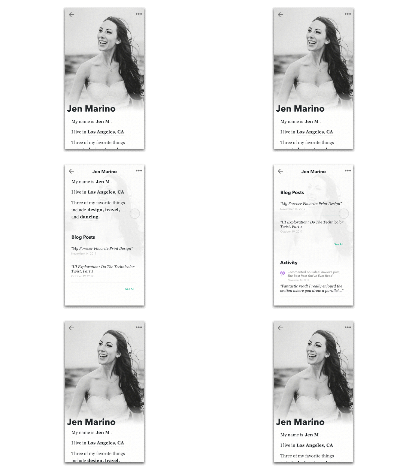
Daily UI Challenge 006 - User Profile

For this challenge piece, I wanted to create an animation to further show additional content as well as push myself past posting just a static image.Overall, I wanted to design a user profile that feels more as if it's telling a story than pushing o…

For this challenge piece, I wanted to create an animation to further show additional content as well as push myself past posting just a static image.

Overall, I wanted to design a user profile that feels more as if it's telling a story than pushing out stats. The content focuses more on the person and I feel that the typography aids in that goal.

tags: design, graphic design, user interface, user interface design, ui design, ui design challenge
categories: design
Monday 07.02.18
Posted by Jennifer Donohue
 

UI Exploration: Do the Technicolor Twist, Part 1

Working with brand guidelines can put a designer in a real funk when it comes to colors. We stick to what has been approved albeit our personal preferences. I personally have designed so many blue things I thought that I had seen the gamut of shades of blue but, nay! More were to be found. In the past year and a few months, I focussed solely on the color green with 17hats. (Green for positivity! money! success! more money!) Needless to say, I am now ready to work on projects that have NO GREEN! 

Recently, a friend approached me with a UI project for his current endeavor: DropTrack. This product is a music marketing platform for musicians, djs, etc. to get their music into the hands of record labels, other artists, bloggers, and more. As someone who is a musician and music takes up 1/3 of life, I knew that this would be a fun opportunity. The original screens that were presented to me were laid out with an engineer's precision for functionality and ready to take on some designer TLC. I asked the owner, "How do you feel about adding in more color?" The response was, "Let's see it." 

This post is presented as a Part 1 for a main reason: I am focussing on a few details at a time. The hope with this series is to display these UI elements to really showcase some of the detail work before featuring on the full screen UI.

My relationship with color in this product has been executed in phases. First was the whole page - how do I present an artists tracks elegantly? How can this product be an even better showcase for these artists? From there, color was used with all CTAs, messaging, alerts, tags. If it wasn't body text, it probably was assigned a nifty RGB value. It made the page come alive but in a functional way. Here are a few samples created thus far: 

Dropdown with custom icons for download options. 

Message modals. Success alert uses a non-traditional blue/green gradient that is upbeat but not overpowering. Error alert uses a burnt orange gradient versus a bright red to reduce reactionary stress for the user.

Payment modal. Uniting the CTA header text with CTA button with a fabulous purple.

This project is exciting in the fact that there is a great deal of creative freedom while respecting the product itself. The use of color can still allow for a sleek and modern look if done tastefully and correctly. There's always a reason behind a color selection which is why it is effective. 

Stay tuned for Part 2 to see how the UI on this product develops. 

tags: ui, ui design, process, design, graphic design, icon, iconography, color, color theory
categories: design, graphic design, UI
Saturday 12.03.16
Posted by Jennifer Donohue