• Work
    • Professional Work
    • Mixed Media
  • About
  • Blog
Jen Donohue - Product Designer
  • Work
    • Professional Work
    • Mixed Media
  • About
  • Blog

UI Exploration: Do the Technicolor Twist, Part 1

Working with brand guidelines can put a designer in a real funk when it comes to colors. We stick to what has been approved albeit our personal preferences. I personally have designed so many blue things I thought that I had seen the gamut of shades of blue but, nay! More were to be found. In the past year and a few months, I focussed solely on the color green with 17hats. (Green for positivity! money! success! more money!) Needless to say, I am now ready to work on projects that have NO GREEN! 

Recently, a friend approached me with a UI project for his current endeavor: DropTrack. This product is a music marketing platform for musicians, djs, etc. to get their music into the hands of record labels, other artists, bloggers, and more. As someone who is a musician and music takes up 1/3 of life, I knew that this would be a fun opportunity. The original screens that were presented to me were laid out with an engineer's precision for functionality and ready to take on some designer TLC. I asked the owner, "How do you feel about adding in more color?" The response was, "Let's see it." 

This post is presented as a Part 1 for a main reason: I am focussing on a few details at a time. The hope with this series is to display these UI elements to really showcase some of the detail work before featuring on the full screen UI.

My relationship with color in this product has been executed in phases. First was the whole page - how do I present an artists tracks elegantly? How can this product be an even better showcase for these artists? From there, color was used with all CTAs, messaging, alerts, tags. If it wasn't body text, it probably was assigned a nifty RGB value. It made the page come alive but in a functional way. Here are a few samples created thus far: 

Dropdown with custom icons for download options. 

Message modals. Success alert uses a non-traditional blue/green gradient that is upbeat but not overpowering. Error alert uses a burnt orange gradient versus a bright red to reduce reactionary stress for the user.

Payment modal. Uniting the CTA header text with CTA button with a fabulous purple.

This project is exciting in the fact that there is a great deal of creative freedom while respecting the product itself. The use of color can still allow for a sleek and modern look if done tastefully and correctly. There's always a reason behind a color selection which is why it is effective. 

Stay tuned for Part 2 to see how the UI on this product develops. 

tags: ui, ui design, process, design, graphic design, icon, iconography, color, color theory
categories: design, graphic design, UI
Saturday 12.03.16
Posted by Jennifer Donohue
 

Product Review: UI Stencils

As a designer who has an affinity towards pen and ink as primary tools of the trade, I always look to see what fun products are available to aid in UI and UX development. I came across UI Stencils while going on a slight binge to up my wireframing game. 

A main component of my process as a UX designer is transferring any and all ideas onto paper. The sketches are my shorthand and allow me to communicate actions and flows faster than working on the computer (some may call this odd, I call this one of the wonders of Jen's designs).  By fleshing out actions, gestures, questions, etc. via sketching, I am able to cut down on time spent on a series of digital wireframes that can sometimes lead to a collection of chaos. What I mean by that is artboards that go on forever and the idea you want to execute gets lost. 

Enter UI stencils. They have thought of everything and I felt like Christmas came early when I browsed their product list. I went ham on adding items to my cart - stencils for iOS, Android, Web, gestures(!!!), a pixel ruler, and an every day carry kit (because everyone should have this in their pocket, am I right?). It didn't end there. Then began the addition of all the Sketch pads to pair with the stencil kits. Whoa! 

iOS Stencil, iOS Sketch Pad, Pixel Ruler, Micron 0.5

My arsenal was full and ready to be used. I created incredibly detailed sketches that aided in my conversations with developers and stakeholders for feature development. Some of the developers had hearts in their eyes for some good old fashioned paper drawings stating, "this is why pen and paper should still be used." It felt like a huge win to me. With these wireframes, I accurately transferred the designs into PRD's and used them as the base for my digital wireframes. Process streamlined even more. 

Yet with all the praises I have for these products come a few places for improvement. I found that many of the icons were just too large and felt like they would have been great back with older iOS guidelines for image sizes. Times have changed and we are no longer constrained to 44px! Icons were especially large when I used a fine pen such as 0.1 or 0.5, the sizes I comfortably use for sketching. Another wish list item would be horizontal lines for main UI components such as navigation tab bars, top bars, etc. While there is a small notch on the side to indicate where to draw the line, that secondary step could be eliminated by a simple thin line etched out. The last "please make this happen" item was a fuller notes section. I would love to be able to write out more notes alongside the devices. Yes, this would call for a larger sketchpad but SO WORTH IT in the long run. 

Overall, everyone who encountered either the UI Stencils products or my sketches created using their products was incredibly pleased. It made sketching not just more fun but more accurate to tell a feature story even better. 

Thanks UI Stencils for the stellar products! 

tags: ux, ux design, ui, ui stencils, wireframe, process, design, designer, ux designer, stencils, sketch, sketch pad, tools
categories: design, graphic design, project management, sketch, UX
Friday 12.02.16
Posted by Jennifer Donohue
 

#ArtsyNotes - Day 3

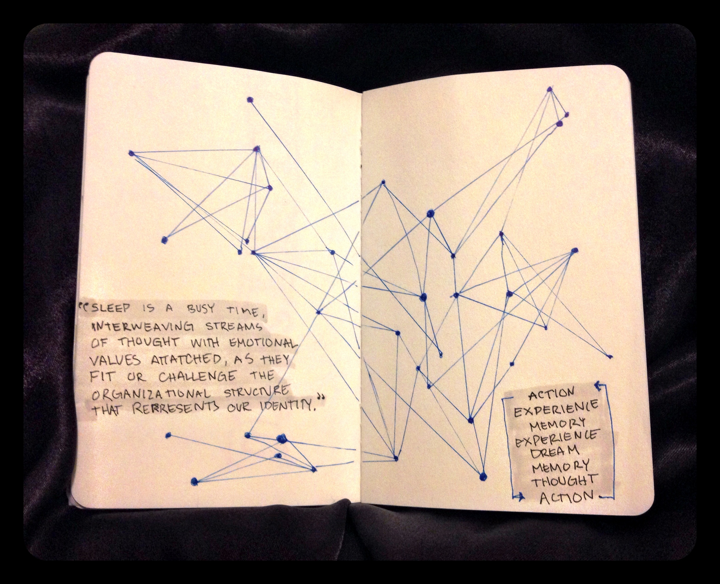
What occurs in our minds while we are sleeping is a subject where new discoveries are occurring faster than one would imagine. We understand the basis that sleep allows us to regenerate and to grow. A large piece of the puzzle was finding out what type of activity occurs with our mind while our bodies are in this slumber. I began reading “The Science of Sleep: Dreaming, Depression, and How REM Sleep Regulates Negative Emotions” by Maria Popova because this topic has always fascinated me. I’m also interested in understanding negatives in life because like that cliché saying “Light cannot exist without darkness” and I feel it’s better to understand the darkness and what its cause is for each of us individually. Simply put, I’m a fan of process and understanding one’s process.


Turns out, our dreams aid in the creation of our processes. Towards the latter end of the article, Popova references Rosalind D. Cartwrights writing “ The Twenty-four Hour Mind: The Role of Sleep and Dreaming in Our Emotional Lives” which discusses how dreaming is a part of our cycle in forming habits, both intellectually and physically. Each time we take action, it creates an experience which in turn creates a memory. Experiences continue to happen forming new memories which we then dream about. We sort the information while sleeping and rank it according to what we should remember and what can be placed on the back burner. As we sort the information, we create new memories while dreaming about our experiences. Ultimately, a pattern occurs where how we think determines how we act which directs what our dreams will be. The feeling of the mind never “shutting off” is quite real and a very accurate statement at that.


The more patterns I discover the happier I am because I believe that everything is interconnected to some level. Cause and effect. Action and reaction. I always knew that dreaming was the brain’s rating system but did not fully come to appreciate how it is a part of our habit building process. The influence of thinking positively and being mindful in your speech and actions holds even more validity when it is reinforced not only while awake and fully conscious in the experience but also while you are asleep! Ah, patterns and process, these are a few of my favorite things.

tags: #artsynotes, 30 day challenge, typography, dreams, patterns, process
Saturday 11.22.14
Posted by Jennifer Donohue