• Work
    • Professional Work
    • Mixed Media
  • About
  • Blog
Jen Donohue - Product Designer
  • Work
    • Professional Work
    • Mixed Media
  • About
  • Blog

My Forever Favorite Print Design

Three hundred sixty one days ago my morning started off in an airplane on a red eye flight to Miami. My parents, then fiancé, and I traveled to Florida for a week of preparation and relaxation (or insanity as it turned out to be) for my wedding day. As I'm musing about the time almost one year later, I wanted to think about all the details that I stressed over and wonder if it was really worth it? 

Of course as a designer, I created everything that went into this event. Save the date cards, invitations, escort cards, table numbers, signage, even a custom label for cigars. Most importantly I designed the experience of the big day. Looking back on it all, memories of planning that remain with me in the forefront are those around designing our invitations. 

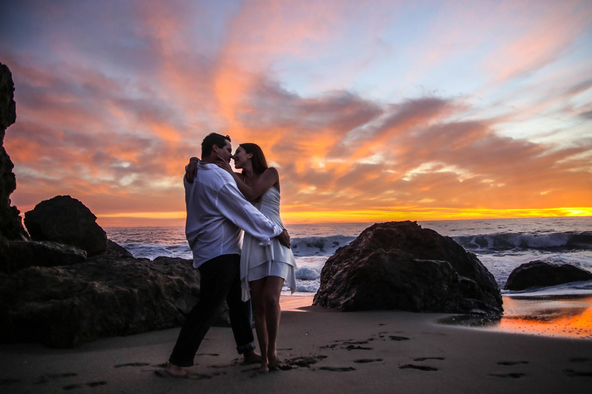
When the time came to begin sketching up ideas and creating a few mocks, I immediately had a vision of what was to be accomplished. My husband – a.k.a. client number two – had few requirements and overall told me to do my thing. Our friend and engagement photographer Danny shot the most stunning photographs at Point Dume beach in Malibu, CA. The vibes were on point and the weather was perfect. We all spent the day together as friends and he documented some surreal moments. Needless to say, he made the content portion of my design easy. 

12440468_10207526726060856_4207536838524679617_o.jpg 12357049_10207526729860951_6870593074919113744_o.jpg 12525462_10207526738181159_6165978933850013060_o.jpg 10286876_10207526734061056_9119258513019728285_o.jpg 12401913_10207526731020980_5285140830570753323_o.jpg

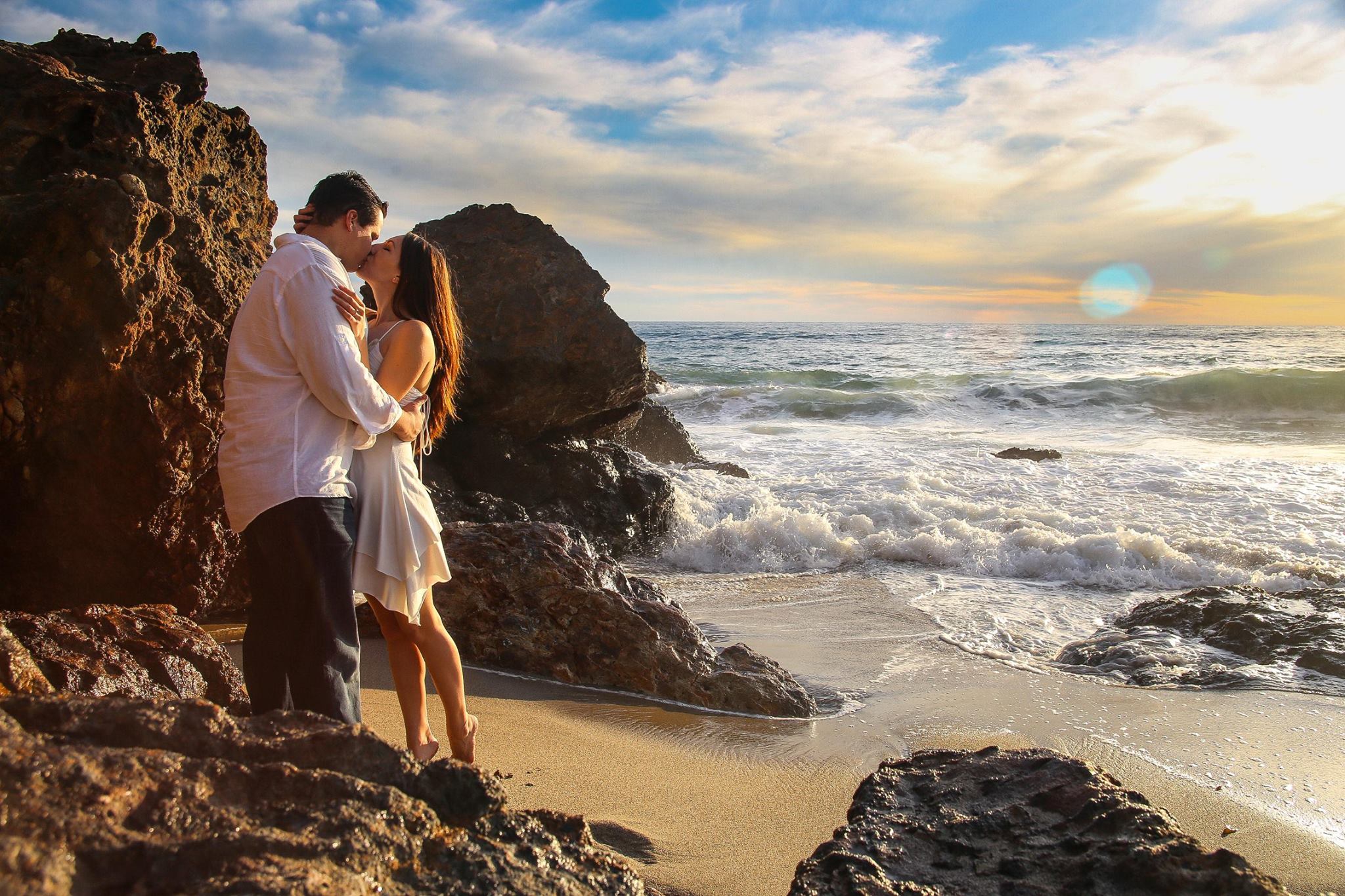
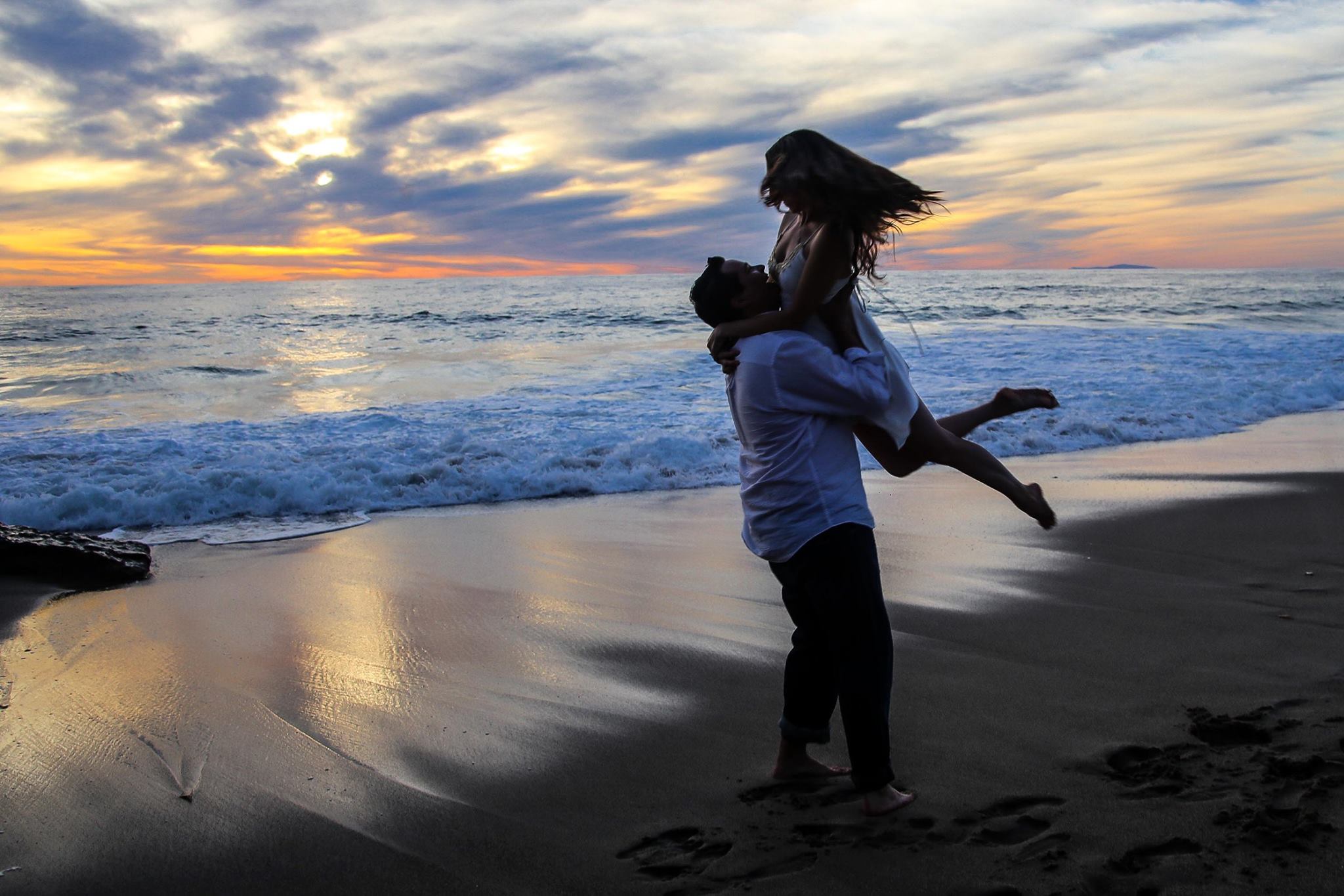
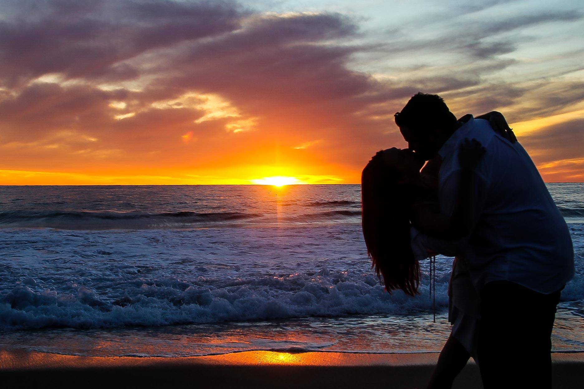
Photographs by Daniel Leist 

The mood board was simple: a few hues of royal purple and gold, a modern art deco typeface, and simple accent graphics. This was singlehandedly the clearest I have ever seen a design in my mind and transpose it so perfectly into a tangible item. With our Save the Date cards, I was able to test out the palette and font combinations. They were timeless yet felt casual for a modern age. Being overjoyed with the results, the next design of the invitations were executed so quickly it left me feeling slightly bewildered. "It's never this easy," I remember thinking to myself. 

Save the Date cards

Flying back from St. Louis to Los Angeles, I whipped out my laptop and zoned in. Two hours later I had my design. We made a single change and sent to print. My vision was one of a 5" x 7" landscape card with a gate fold. Guests would receive a royal purple envelope that had an incredible textured surface – immediately setting a tone. The most labor intensive DIY project was addressing each invitation by hand with gold ink. But damn if I, a typography aficionado, would have anything less than my hand calligraphy on my wedding invites! (Which sped up the impending tendinitis in my arm but we do it for our craft, right?) Each invitation was wrapped in gold ribbon and once the guest opened the two folds, the main text of our names, invitation script, and a full bleed photograph of us overlooking the Pacific Ocean would allude to our ceremony taking place on the beach. 

Custom monogram with my favorite ampersand (Baskerville italic) in the history of ampersands 

Custom monogram with my favorite ampersand (Baskerville italic) in the history of ampersands 

Most brides play with color swatches for flowers and table linens. I play in a Pantone world where those are the only swatches that matter. At this stage of the project, we were working with our friend Jose who was our printer. I'll never forget when he called and said the test run was ready for pickup and he couldn't' wait to show us. We drove down to Orange County and I held the mock in my hands, smiling down upon it as if it were my firstborn. The alignment and colors were perfect. Two weeks later we had our invitations and off they went via post. 

Photograph by 3 Little Words

Photograph by 3 Little Words

There is so much pride I have for this project because it came to life not only from my mind but with the involvement of my husband and our friends. It was nurtured and given such consideration and careful thought with each piece. Yet it was so natural and organic of a process. The passion to create this idea instead of chasing perfection led to my forever favorite print design. 

It's easy for us designers to get hung up on an idea, a step in our process, trying to achieve the ultimate solution. What we need to remember to do is just listen to our intuition and keep in mind that these ideas and these visions we have are reasons as to why we are creatives and to roll with it. Stop thinking and just do.

Photograph by 3 Little Words

Photograph by 3 Little Words

tags: design, print, print design, pantone, wedding invitations, graphic design, typography
categories: design
Tuesday 10.24.17
Posted by Jennifer Donohue
Comments: 1
 

A typographic love affair with Johnny Cash

Sweet melodies with that deep, soulful voice enveloped my mind. Johnny Cash playing in the background while I organized my day turned from me writing out a to-do list to writing out lines from the songs which filled the room. A-ha! A new project...

Here are a few quick works in progress shots. I wanted to focus on having a light and airy feel with the ink to contrast with his voice. As I finalize the lettering I'll then be incorporating imagery with the type. 

"If I could read your mind, love, 
What a tale your thoughts could tell."
tags: design, typography, type, lettering, ink, johnny cash, country music, wip, work in progress, dot grid, moleskine
categories: design, typography, graphic design, sketch
Tuesday 07.28.15
Posted by Jennifer Donohue
 

#ArtsyNotes - Day 3

What occurs in our minds while we are sleeping is a subject where new discoveries are occurring faster than one would imagine. We understand the basis that sleep allows us to regenerate and to grow. A large piece of the puzzle was finding out what type of activity occurs with our mind while our bodies are in this slumber. I began reading “The Science of Sleep: Dreaming, Depression, and How REM Sleep Regulates Negative Emotions” by Maria Popova because this topic has always fascinated me. I’m also interested in understanding negatives in life because like that cliché saying “Light cannot exist without darkness” and I feel it’s better to understand the darkness and what its cause is for each of us individually. Simply put, I’m a fan of process and understanding one’s process.


Turns out, our dreams aid in the creation of our processes. Towards the latter end of the article, Popova references Rosalind D. Cartwrights writing “ The Twenty-four Hour Mind: The Role of Sleep and Dreaming in Our Emotional Lives” which discusses how dreaming is a part of our cycle in forming habits, both intellectually and physically. Each time we take action, it creates an experience which in turn creates a memory. Experiences continue to happen forming new memories which we then dream about. We sort the information while sleeping and rank it according to what we should remember and what can be placed on the back burner. As we sort the information, we create new memories while dreaming about our experiences. Ultimately, a pattern occurs where how we think determines how we act which directs what our dreams will be. The feeling of the mind never “shutting off” is quite real and a very accurate statement at that.


The more patterns I discover the happier I am because I believe that everything is interconnected to some level. Cause and effect. Action and reaction. I always knew that dreaming was the brain’s rating system but did not fully come to appreciate how it is a part of our habit building process. The influence of thinking positively and being mindful in your speech and actions holds even more validity when it is reinforced not only while awake and fully conscious in the experience but also while you are asleep! Ah, patterns and process, these are a few of my favorite things.

tags: #artsynotes, 30 day challenge, typography, dreams, patterns, process
Saturday 11.22.14
Posted by Jennifer Donohue
 

#ArtsyNotes - Day 2

I’ve recently been striving to find that perfect balance of accomplishing my professional, emotional, and personal goals, all while maintaining a level of stability and calm persona. While trying to keep everything on track I found it was easier than it should be to find myself being distracted or not putting in 100% of my effort. I would sprinkle my all here and there but was not fully committing myself to everything at all times. It is understood that being completely attentive to each issue that presents itself in life won’t always happen; we’re human and mistakes occur.


All in all, what I want to accomplish in each aspect of my life is comprised of a simpler path than I have imagined. As Charles Bukowski once said, “My ambition is handicapped by laziness.” Now, this is not to say that I am a lazy person rather, that in the past few months life has just been so life-y and I have let it begin to get the best of me. Pointing to yesterday’s post, one of the Seven Deadly Sins of Speaking that I was applying to my thoughts was excuses. Projects and attendance at events were delayed because it was “not the right time.” But that’s just a whole lot of nonsense. It is very much a realistic idea to accomplish all I set out to do and my boyfriend has been that voice of support in reminding me that it all comes down to discipline. It’s as simple as that and I could not agree more with him. By continually pushing yourself and taking control of all situations you will reach your full potential. We create these roadblocks for ourselves that are completely unnecessary. My Grandmother said to me the other night that, “Being alone with your mind in the dark is one of the most dangerous things.” We can too easily bring doubt and negativity where it does not belong.


Everyday I remind myself to be conscious of my actions but most importantly what will result from them. Will my actions bring negativity or positivity to my life? Taking the easy route in my experience has generally brought nothing but plateaus that have yet to be conquered. Everything is a learning experience and it’s best to not feel blue when things do not go the way we intend. Instead, learn from the actions and results to create a path which leads to the desired outcome. Control your actions and thoughts for your own betterment, no one else will do this for you.


I chose to employ a pointilist style for the lettering of this piece because deep down inside I just love a good pun. It took a decent amount of time for what is being considered a “quick sketch” because each letter was formed by placing a dot one at a time to create the outline. This is a technique which I greatly enjoy producing and experimenting with - next time I’ll be mindful to maybe not use this style for a project right after an upper body intensive yoga class. Or perhaps therein lies the challenge!


tags: typography, design, type, pointilism, art, lettering, discipline, ink, graphic design, #artsynotes, 30 day challenge
Thursday 11.20.14
Posted by Jennifer Donohue
 

#ArtsyNotes - Day 1

Image:  Jennifer M. Donohue™ 2014

I love TED talks, not only for their information and enjoyable anecdotes, but for simply having spoken word playing while I am working on design projects. It has a pleasant effect and allows me to tune out to either take a break from a creative roadblock or to design without overthinking. Today I listened to Julian Treasure’s excerpt, “How to speak so that people want to listen.” In his brief monologue, he outlines how attitude, sound, and meaning all affect the degree to which others listen to us while speaking. The main section that really stood out to me was what he called the, “Seven Deadly Sins of Speaking” which are as follows:

  • Gossip

  • Judging

  • Negativity

  • Complaining

  • Excuses

  • Lying

  • Dogmatism

All of these have their own forces to deter others from wanting and/or having the capabilities to listen to us carefully and attentively. Ultimately, this leads to inhibiting our own personal growth as well as cultivating meaningful relationships and developing a strong community. Spoken word is a staple of civilization and if it is not respected or paid attention to, we all lose. He ended the speech with one of the best portrayals of empathy I have ever heard:

“...what would the world be like if we were creating sound consciously and consuming sound consciously and designing all our environments consciously for sound? That would be a world that does sound beautiful, and one where understanding would be the norm, and that is an idea worth spreading.”

Paying attention to how we speak, what we are saying, and the context in which we are expressing ourselves is one of the most beneficial things a person can do. Today, challenge yourself to not give into any of the Seven Deadly Sins of Speaking and instead begin to pay attention to what you say and how you are saying it.

tags: design, sketch, ted, ted talks, Julian Treasure, typography, #artsynotes
Wednesday 11.19.14
Posted by Jennifer Donohue
 

#ArtsyNotes

Being a typography aficionado and someone who loves to note down thoughts and ideas that are either spontaneous or from articles I’ve read, I wanted to try something new by merging these two interests. This is where #ArtsyNotes comes into play - a 30 day “challenge” where I create typographic pieces of the notes I’d usually just scribble into my mini Moleskine.


I’d like to use this as a time to challenge myself with my own styles as well as discover new fonts, styles of writing, and mediums to produce these pieces. At the end of this project, I will be creating a collage using elements from all thirty days.

Imag: Jennifer M. Donohue™ 2014


tags: typography, design, project, sketch, moleskine, 30 day challenge
Wednesday 11.19.14
Posted by Jennifer Donohue