• Work
    • Professional Work
    • Mixed Media
  • About
  • Blog
Jen Donohue - Product Designer
  • Work
    • Professional Work
    • Mixed Media
  • About
  • Blog

Design Is For More Than Business Cards

After the tragic incidents which occurred in Paris, the masses took to social media for support. Messages of solace, love, and sorrow were all expressed through words and images. It's beautiful to see so many people from around the world unite even under the worst of circumstances to shine some light in such a dark hour. 

Before hearing the news yesterday afternoon, my fiancé and I had been researching supplies for our bug-out/earthquake bag. The search took a backseat while following the events, work, and discussion around the state of affairs occurred. When the hunt resumed, I began to type into amazon's search bar for "emergency supplies" and made it as far as typing "emer" before stopping in my tracks. Amazon had implemented their message of support with an extremely simple yet effective design. 

One color, one graphic, and one word combined to create endless messages. Not to mention the graphic and type in the top right corner used as global elements in the top bar added even more impact. The design is powerful in its simplicity. 

This is a prime example of how design is used for meaning. A majority of people (although the thinking is changing more so nowadays) believe design is just for making things pretty. And while that is an objective, it is not necessarily the main goal. We, designers, are storytellers. We are people with messages to be conveyed which are to not just be absorbed but rather to ignite discussion, thoughts, and in some cases, for people to take action. This design by amazon pushed the state of affairs point blank to the viewer. 

Amazon is not the only site to make changes which demonstrate support. Facebook brought back the profile picture filter using the French flag's colors and design. To some, the idea of changing a profile photo seems incidental, meaningless. But to others, it can mean a great deal. After the gay marriage ruling by the Supreme Court in the U.S. earlier this year, Facebook revealed this feature of the profile picture filter with a rainbow color scheme. Millions of people changed their image to demonstrate support for the cause. Members of the LGBTQ community responded by stating that the image change was meaningful to them when seeing their straight peers visually advocate for the cause . I hope that now, there is a similar effect with the current feature. The design brings about conversation and awareness. When some do not know how to act or do not have the means to financially or physically provide assistance, there is an outlet to visually express their feelings. What may seem like a small action to some could potentially provide a large impact for another.  

Design may not save the world but it will certainly help to bring awareness, conversation, and ideas to the forefront. And in my eyes, that certainly takes us one step closer.  

tags: design, graphic design, ui, social media
categories: graphic design, design
Saturday 11.14.15
Posted by Jennifer Donohue
 

Today's Inbox Happiness :: InVision User Testing

*squeeeee!*

*squeeeee!*

Ok InVision, you already make my life easier with prototyping and your blog brings me much joy. I look forward to receiving the newsletter and checking out the webinars. 

But lo, what is this? User Testing? USER TESTING! I can not explain how much time I feel the process of gathering information from user tests is wasted based on clunky systems. Collecting data in a poorly filled out excel file, watching videos where testing software is being glitchy and affecting the results, and, sifting through all the information in sub-par programs just wastes too much of my time. 

After viewing the blog post on InVision's page, I have high hopes that even in beta this product will streamline the user testing process. So far the MVP feature set is solid, I look forward to how this develops! 

tags: des, designer, user testing, invision, invisionapp, ux, ui, mobile design, web design
categories: design, project management
Friday 08.07.15
Posted by Jennifer Donohue
 

A typographic love affair with Johnny Cash

Sweet melodies with that deep, soulful voice enveloped my mind. Johnny Cash playing in the background while I organized my day turned from me writing out a to-do list to writing out lines from the songs which filled the room. A-ha! A new project...

Here are a few quick works in progress shots. I wanted to focus on having a light and airy feel with the ink to contrast with his voice. As I finalize the lettering I'll then be incorporating imagery with the type. 

"If I could read your mind, love, 
What a tale your thoughts could tell."
tags: design, typography, type, lettering, ink, johnny cash, country music, wip, work in progress, dot grid, moleskine
categories: design, typography, graphic design, sketch
Tuesday 07.28.15
Posted by Jennifer Donohue
 

Happy Details :: Waze on iOS

Alright Waze, you just put a smile on my face. This simple question makes my life that much easier when leaving home, a very nice UX choice. Especially since there's a LOT of red on the map the whole journey. Thank you for knowing my schedule so well and for combating LA rush hour traffic. 

tags: design, ux, waze
categories: design, UX, UI
Tuesday 07.07.15
Posted by Jennifer Donohue
 

Organizing Information :: How Do You Divide?

Ever since elementary school, I've had various pens and highlighters, notebooks of various sizes, and post-it notes to create the ultimate method of organization. Never caring for store-bought planners, each of mine were designed in a fashion which worked for me - how I mentally divvy up information to have the maximum retention. It's grown from composition books and Bic black and blue pens to Moleskine's with Micron pens and Copic markers (these are a few of my favoriiiteee thiiinggss). 

Task, project, and overall life planning continues to be an exercise in handwriting for me where a hybrid of traditional versus new (i.e. phone calendars and online project management tools) takes place only in the workplace. Basecamp, Unfuddle, and Confluence have all made a presence but nothing quite compares like the grace and ambiguity of ink dashing across the 68 lb. ivory slate of glory that is my notebook. 

Until I met Asana. Finally, a tech savvy match to my method has been found. The web interface is easy enough to work through albeit some of the UI could be enhanced for a sleeker feel which personally provides me with more clarity with information hierarchy. The methods of organization with sections and sub-sections to categorize tasks is one of my favorite features. Thus far, I've created projects for my design work, business docs, and specific meetings (weekly check-in is my favorite). The ease of inputting ideas, to-do items, and methods of labeling objects have greatly affected my work flow in a positive manner. The iOS app is very well done with a simple UI that allows you to focus on the tasks at hand. Not to mention the color palette is quite rich which is a nice variant compared to many apps out there right now which focus on a stark white or near black theme. 

What I enjoy most about Asana is the information sharing and interaction features for other team members. Thus far, my only team member is my fiancé, who is the other half of our company. We are easily able to share ideas in the conversations tab which allows for not just text but also image uploads. Emails are sent when these are started to help notify you and keep the conversation in real-time. Most importantly, this keeps my thoughts and ideas in an accessible place providing for the utmost transparency regarding vision and product development, something my lovely Moleskine can't provide unless I physically open and show it to another person. 

Thank you Asana for finally providing a tool that allows for tailored organization, increased productivity, and overall,  a way to track the progress and excitement of an idea coming to fruition. 


The notebooks and Asana lived happily ever after...

 
tags: moleskine, micron, design, ui, ux, asana, project management, organization, designer, copic, UI, UX
categories: design, project management, graphic design, UI, UX
Saturday 07.04.15
Posted by Jennifer Donohue
 

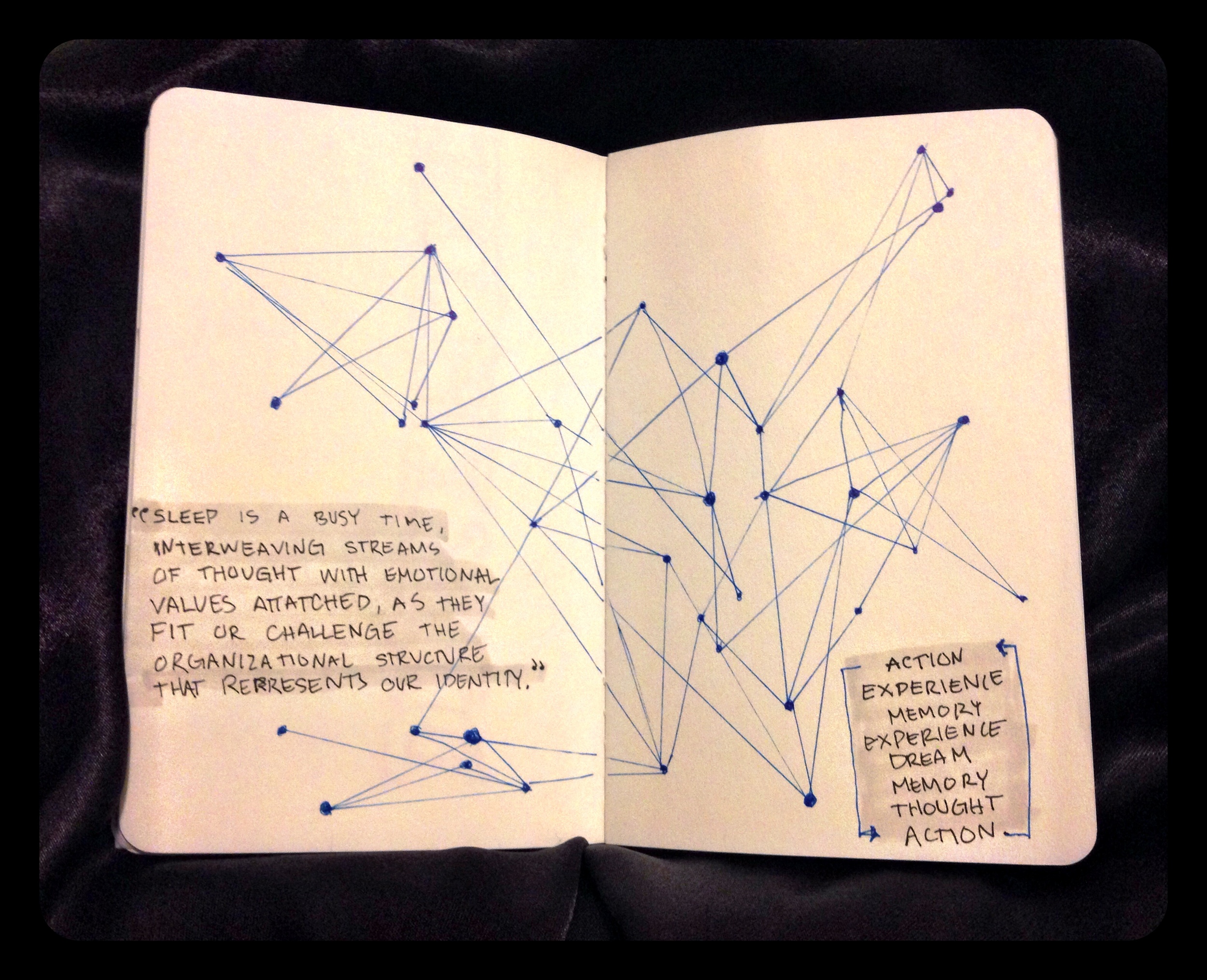
#ArtsyNotes - Day 3

What occurs in our minds while we are sleeping is a subject where new discoveries are occurring faster than one would imagine. We understand the basis that sleep allows us to regenerate and to grow. A large piece of the puzzle was finding out what type of activity occurs with our mind while our bodies are in this slumber. I began reading “The Science of Sleep: Dreaming, Depression, and How REM Sleep Regulates Negative Emotions” by Maria Popova because this topic has always fascinated me. I’m also interested in understanding negatives in life because like that cliché saying “Light cannot exist without darkness” and I feel it’s better to understand the darkness and what its cause is for each of us individually. Simply put, I’m a fan of process and understanding one’s process.


Turns out, our dreams aid in the creation of our processes. Towards the latter end of the article, Popova references Rosalind D. Cartwrights writing “ The Twenty-four Hour Mind: The Role of Sleep and Dreaming in Our Emotional Lives” which discusses how dreaming is a part of our cycle in forming habits, both intellectually and physically. Each time we take action, it creates an experience which in turn creates a memory. Experiences continue to happen forming new memories which we then dream about. We sort the information while sleeping and rank it according to what we should remember and what can be placed on the back burner. As we sort the information, we create new memories while dreaming about our experiences. Ultimately, a pattern occurs where how we think determines how we act which directs what our dreams will be. The feeling of the mind never “shutting off” is quite real and a very accurate statement at that.


The more patterns I discover the happier I am because I believe that everything is interconnected to some level. Cause and effect. Action and reaction. I always knew that dreaming was the brain’s rating system but did not fully come to appreciate how it is a part of our habit building process. The influence of thinking positively and being mindful in your speech and actions holds even more validity when it is reinforced not only while awake and fully conscious in the experience but also while you are asleep! Ah, patterns and process, these are a few of my favorite things.

tags: #artsynotes, 30 day challenge, typography, dreams, patterns, process
Saturday 11.22.14
Posted by Jennifer Donohue
 

#ArtsyNotes - Day 2

I’ve recently been striving to find that perfect balance of accomplishing my professional, emotional, and personal goals, all while maintaining a level of stability and calm persona. While trying to keep everything on track I found it was easier than it should be to find myself being distracted or not putting in 100% of my effort. I would sprinkle my all here and there but was not fully committing myself to everything at all times. It is understood that being completely attentive to each issue that presents itself in life won’t always happen; we’re human and mistakes occur.


All in all, what I want to accomplish in each aspect of my life is comprised of a simpler path than I have imagined. As Charles Bukowski once said, “My ambition is handicapped by laziness.” Now, this is not to say that I am a lazy person rather, that in the past few months life has just been so life-y and I have let it begin to get the best of me. Pointing to yesterday’s post, one of the Seven Deadly Sins of Speaking that I was applying to my thoughts was excuses. Projects and attendance at events were delayed because it was “not the right time.” But that’s just a whole lot of nonsense. It is very much a realistic idea to accomplish all I set out to do and my boyfriend has been that voice of support in reminding me that it all comes down to discipline. It’s as simple as that and I could not agree more with him. By continually pushing yourself and taking control of all situations you will reach your full potential. We create these roadblocks for ourselves that are completely unnecessary. My Grandmother said to me the other night that, “Being alone with your mind in the dark is one of the most dangerous things.” We can too easily bring doubt and negativity where it does not belong.


Everyday I remind myself to be conscious of my actions but most importantly what will result from them. Will my actions bring negativity or positivity to my life? Taking the easy route in my experience has generally brought nothing but plateaus that have yet to be conquered. Everything is a learning experience and it’s best to not feel blue when things do not go the way we intend. Instead, learn from the actions and results to create a path which leads to the desired outcome. Control your actions and thoughts for your own betterment, no one else will do this for you.


I chose to employ a pointilist style for the lettering of this piece because deep down inside I just love a good pun. It took a decent amount of time for what is being considered a “quick sketch” because each letter was formed by placing a dot one at a time to create the outline. This is a technique which I greatly enjoy producing and experimenting with - next time I’ll be mindful to maybe not use this style for a project right after an upper body intensive yoga class. Or perhaps therein lies the challenge!


tags: typography, design, type, pointilism, art, lettering, discipline, ink, graphic design, #artsynotes, 30 day challenge
Thursday 11.20.14
Posted by Jennifer Donohue
 

#ArtsyNotes - Day 1

Image:  Jennifer M. Donohue™ 2014

I love TED talks, not only for their information and enjoyable anecdotes, but for simply having spoken word playing while I am working on design projects. It has a pleasant effect and allows me to tune out to either take a break from a creative roadblock or to design without overthinking. Today I listened to Julian Treasure’s excerpt, “How to speak so that people want to listen.” In his brief monologue, he outlines how attitude, sound, and meaning all affect the degree to which others listen to us while speaking. The main section that really stood out to me was what he called the, “Seven Deadly Sins of Speaking” which are as follows:

  • Gossip

  • Judging

  • Negativity

  • Complaining

  • Excuses

  • Lying

  • Dogmatism

All of these have their own forces to deter others from wanting and/or having the capabilities to listen to us carefully and attentively. Ultimately, this leads to inhibiting our own personal growth as well as cultivating meaningful relationships and developing a strong community. Spoken word is a staple of civilization and if it is not respected or paid attention to, we all lose. He ended the speech with one of the best portrayals of empathy I have ever heard:

“...what would the world be like if we were creating sound consciously and consuming sound consciously and designing all our environments consciously for sound? That would be a world that does sound beautiful, and one where understanding would be the norm, and that is an idea worth spreading.”

Paying attention to how we speak, what we are saying, and the context in which we are expressing ourselves is one of the most beneficial things a person can do. Today, challenge yourself to not give into any of the Seven Deadly Sins of Speaking and instead begin to pay attention to what you say and how you are saying it.

tags: design, sketch, ted, ted talks, Julian Treasure, typography, #artsynotes
Wednesday 11.19.14
Posted by Jennifer Donohue
 
Newer / Older