The Daily UI Challenge is a great way to flex the design muscle. I'll be posting my projects here as they are completed and all can be found on my Dribbble page as well.
Daily UI Challenge 001 - Sign Up
I used the opportunity to share some of the inspiration I received walking outside the office last night. It was dusk - the sky had this beautiful teal-blue pop to it, clear as can be, the power lines and mountain in the forefront provided great contrast.
My designs lately have been in a light color scheme so I decided to also challenge myself with a dark UI. Enjoy!
Daily UI Challenge 002 - Credit Card Checkout
Going for a sleek UI and giving Android some love.
For entering the CVV, I envision the two cards swapping places so the back card is now in the foreground.
Daily UI Challenge 003 - Landing Page

In honor of my favorite band, and the fact that I just scored pre-sale tickets, here's a landing page for Depeche Mode.
What do we want? Tickets. When do we want them? Now!
Daily UI Challenge 004 - Calculator

With this challenge I wanted to create a widget that's simple and elegant using a light ui.
Daily UI Challenge 005 - App Icon

This design was inspired by the many plane flights I've been on lately. I fly on different airlines and it would be great to have a centralized app for all my rewards accounts, itineraries, etc.
On another note, it's the first app icon I've designed on a white background. Really enjoyed how the gradient in the shape turned out.
Daily UI Challenge 006 - User Profile
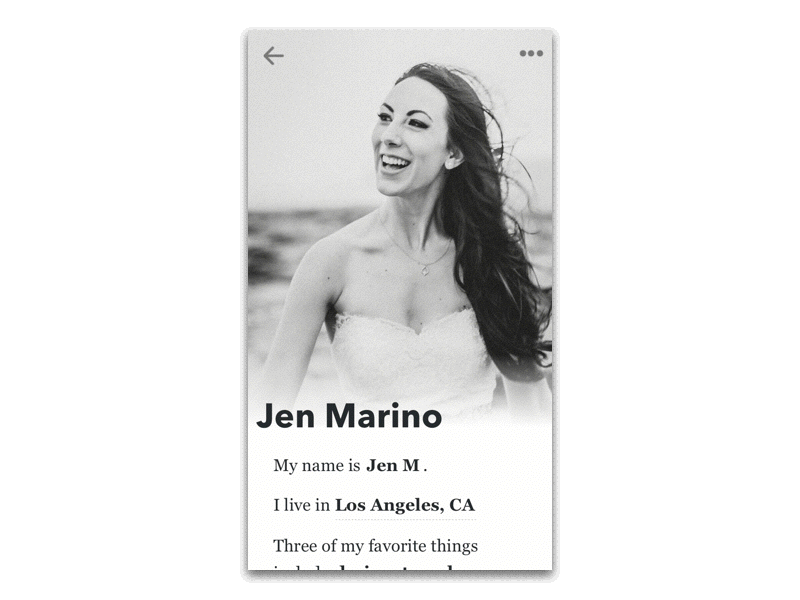
For this challenge piece, I wanted to create an animation to further show additional content as well as push myself past posting just a static image.
Overall, I wanted to design a user profile that feels more as if it's telling a story than pushing out stats. The content focuses more on the person and I feel that the typography aids in that goal.