Pixels
Various digital work created outside of my professional endeavors. These include design exercises, freelance projects, and more.
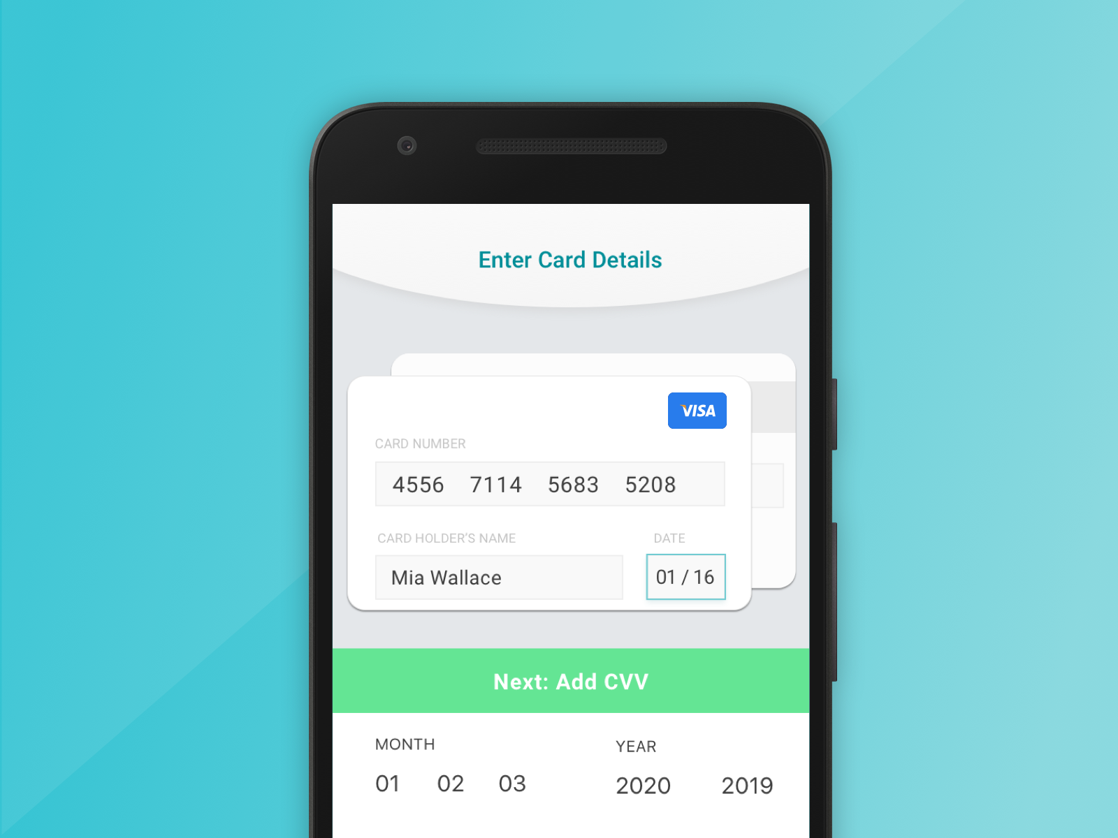
Venmo Redesign - Design Exercise
December 2019
Overview
The Venmo iOS mobile app was chosen for this design test because there is opportunity to increase user satisfaction, user engagement, and perceived product quality. This is achieved by updating the existing UI and optimizing the existing functionality, while introducing more data insights to the user. The entirety of this project was completed in ~4 hours, from initial research to final presentation.
Process

To start this project, I first outlined what the goals of the product are by asking a few questions. What problem is this product trying to solve? How is this product going to make my life easier? Who is this product designed for? This is how I build a base of understanding and then open the app to assess the main screens to focus on. Next, I outlined the product goals. The main actions of the app are to send and receive money where the end goal is to make this transaction easier and faster for all parties involved. Examples include sending/requesting money to friends and family for simple items such as food or tickets; paying for a service that does not accept credit cards. Finally, I assessed what customers are already saying about the product to familiarize myself with what already works and what could be improved upon. The public activity feed has quite the user following which surprised me, where my personal beliefs around financial matters are more private. People like how this app makes financial transfers fun.

Sketching Ideas
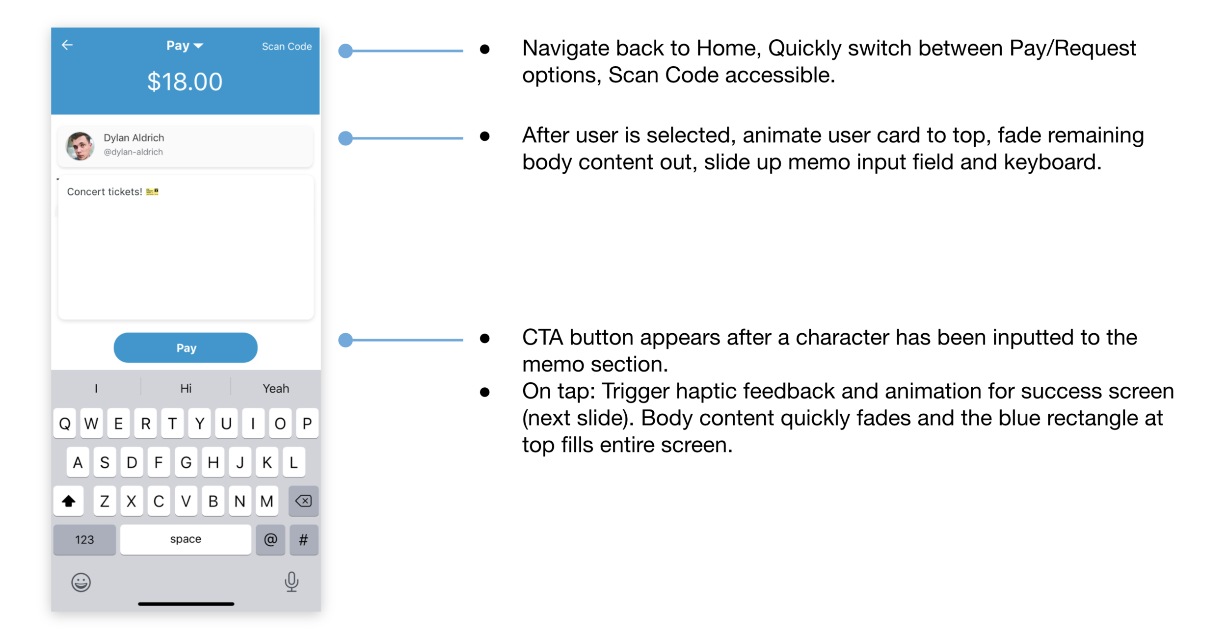
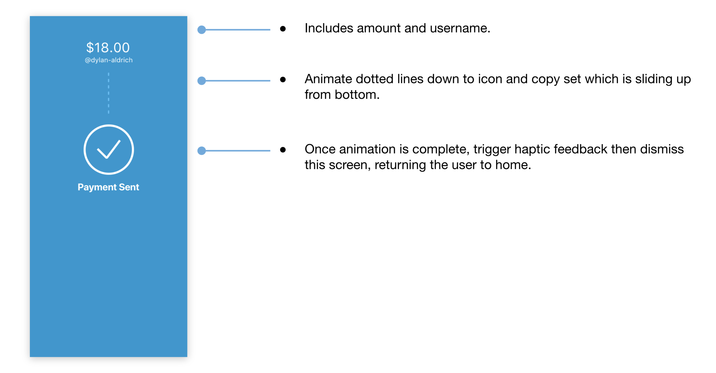
At this point, I began to sketch out ideas for how to improve the overall pay/request experience.
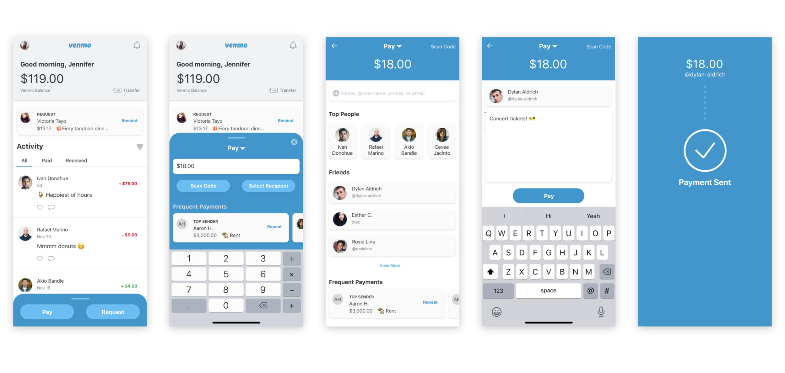
Emphasize these buttons over the current priority of featuring the friend feed
Provide more personal insight and data.
How am I spending my money? What are my trends with sending or receiving money?
Modernize the UI/UX
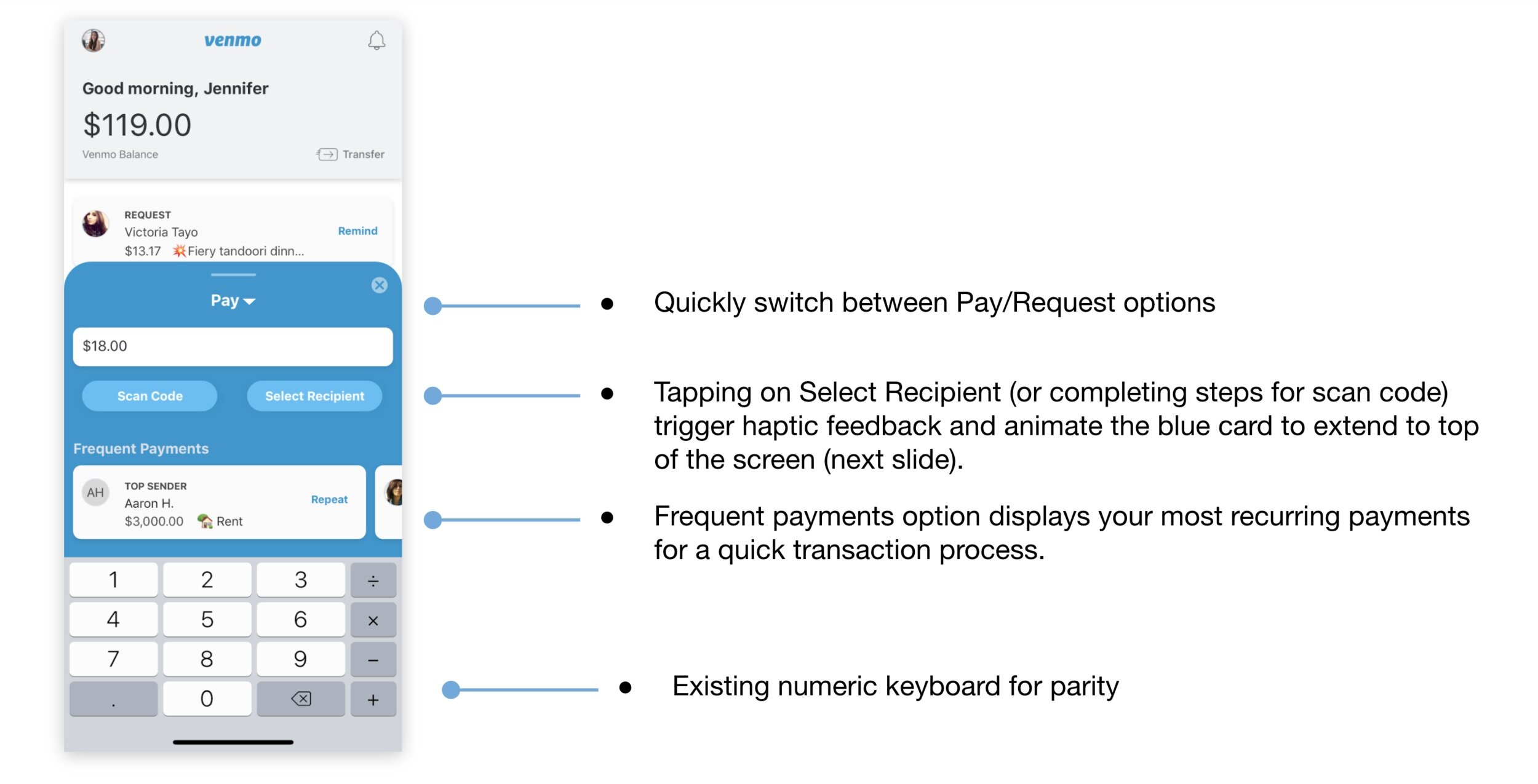
Allow pertinent actions to be surfaced and not hidden behind menus or secondary clicks.
Increase perceived product value.
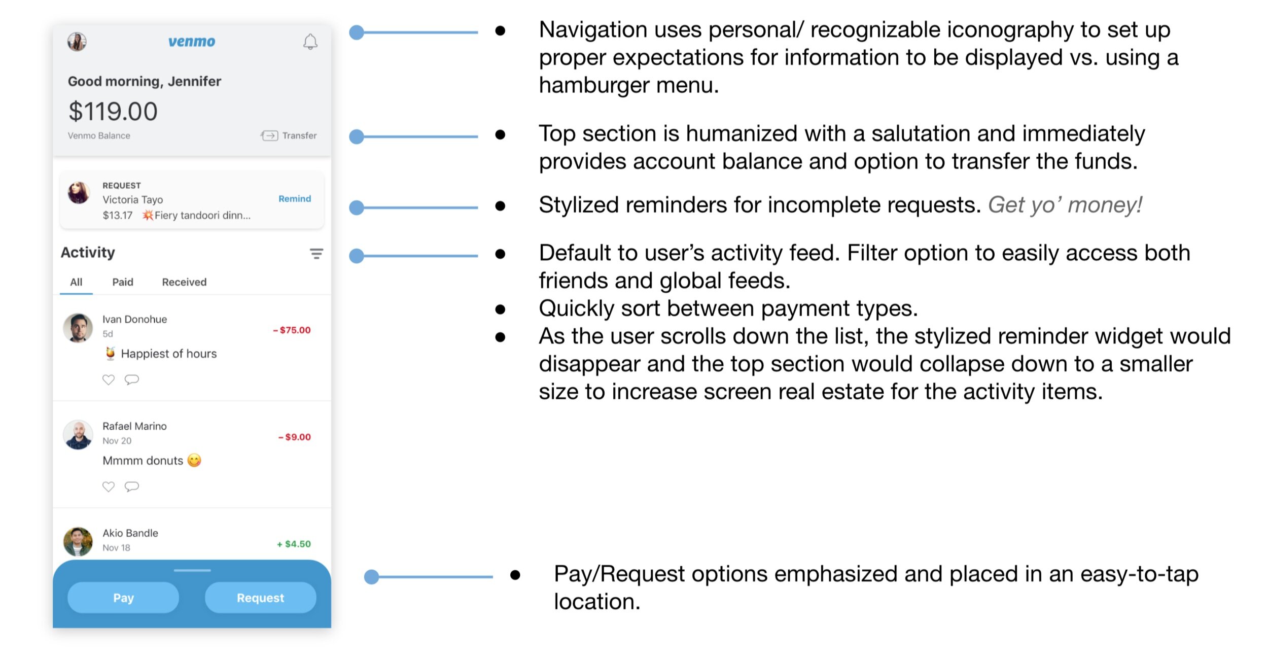
Use animation and haptic feedback to give clues to the user that the process is continuing, actions are being completed.
Reflections
This design test provided a great opportunity to take an app I use frequently and run with ideas that have been swimming around my head for quite some time. Some of my initial UX changes felt like too much of a departure from the existing app, which to me, would not necessarily mean success. Existing users could become confused or disheartened with the modifications. Instead, I focussed on emphasizing the current value the product offers. I believe that the “fun” element is not only maintained but visually heightened with the UI improvements and inclusion of animation and haptic feedback. Overall, there are many more interactions and new (but useful) items to include, which would increase scope of the original ask but be a fun challenge to complete on my own.
Daily UI Challenges
Challenges 1 - 5 created 2017. Read more in the blog post.
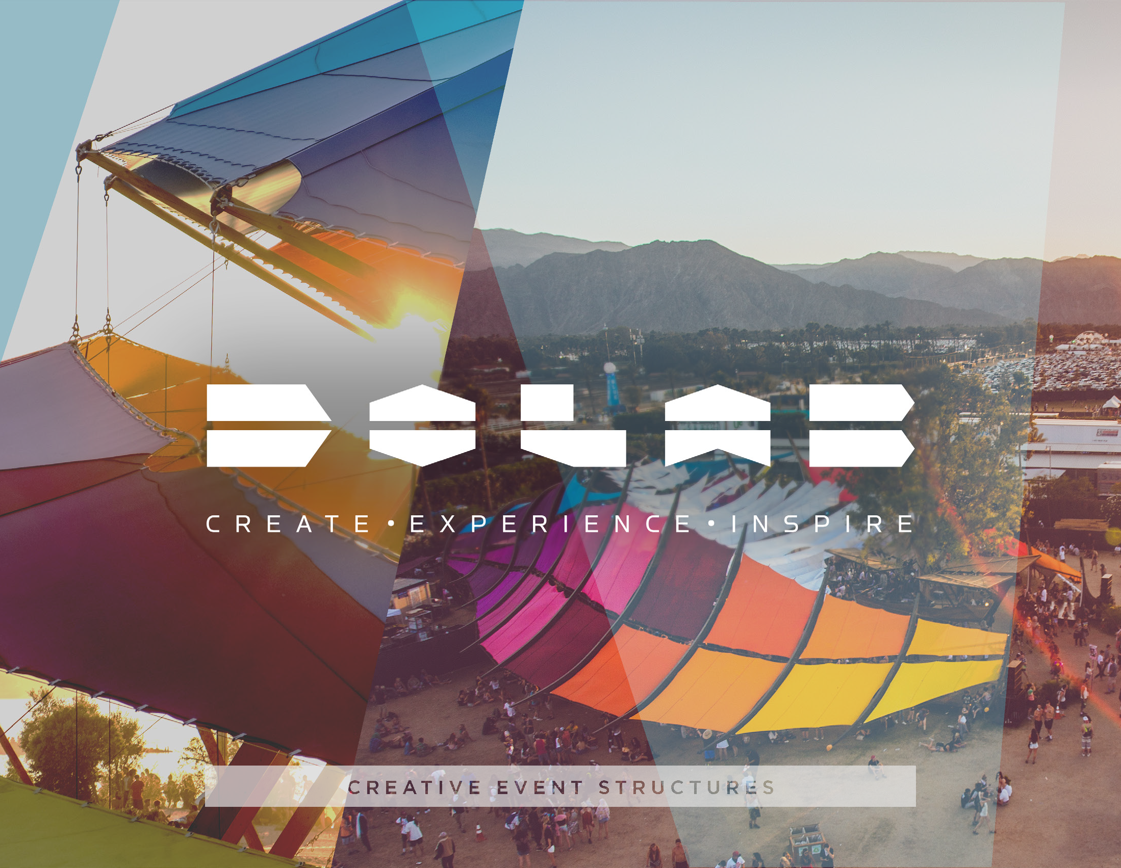
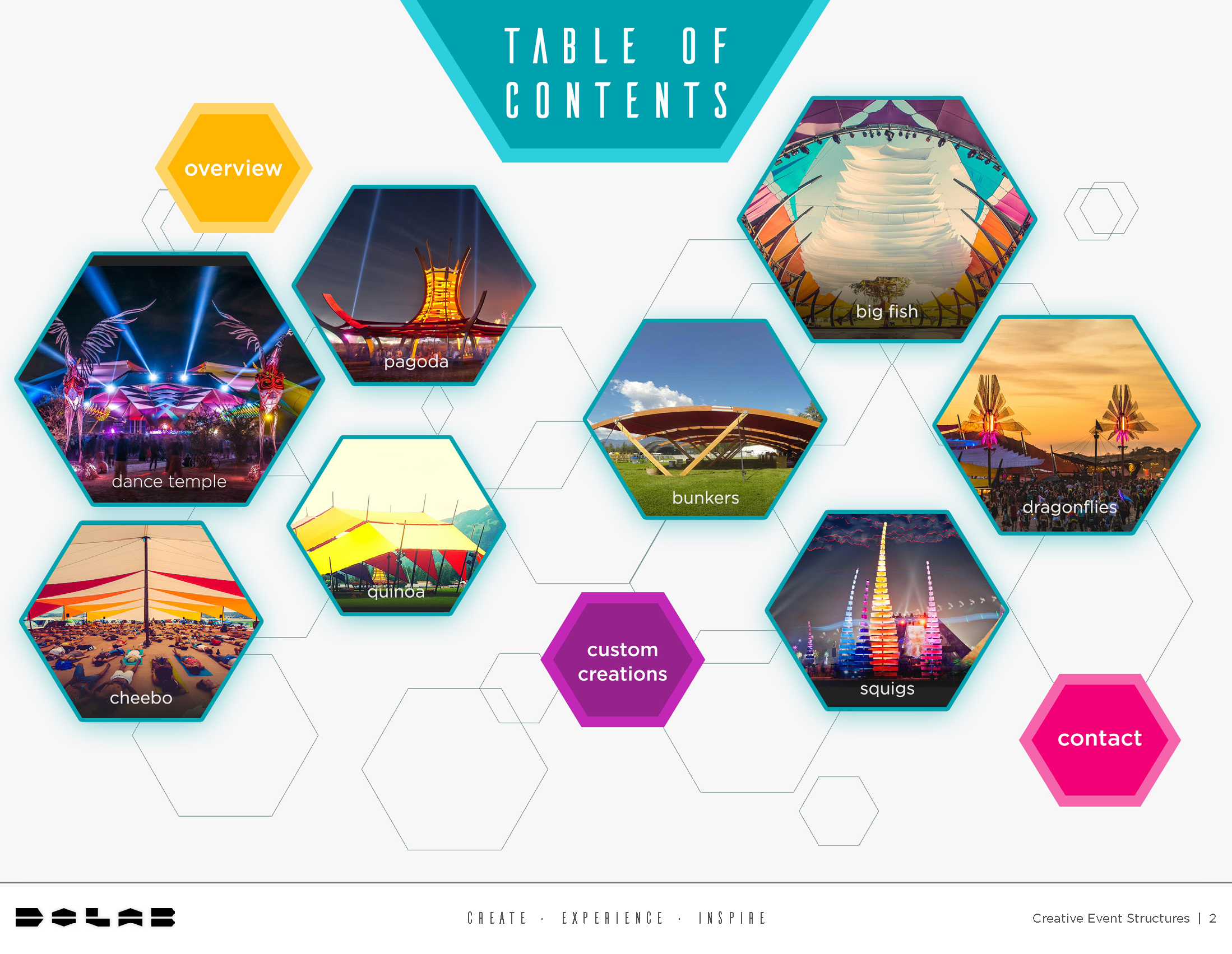
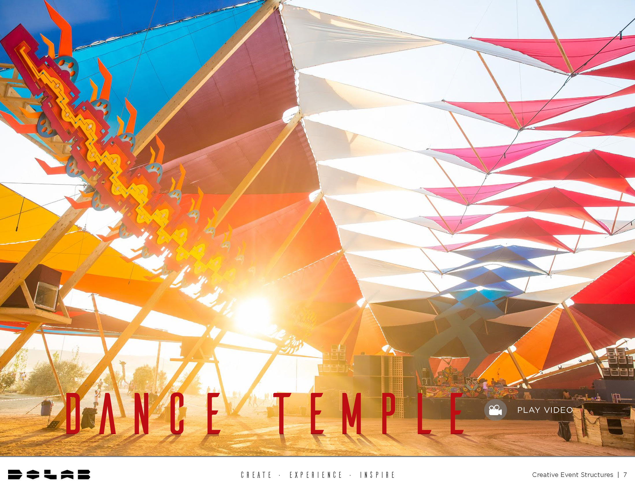
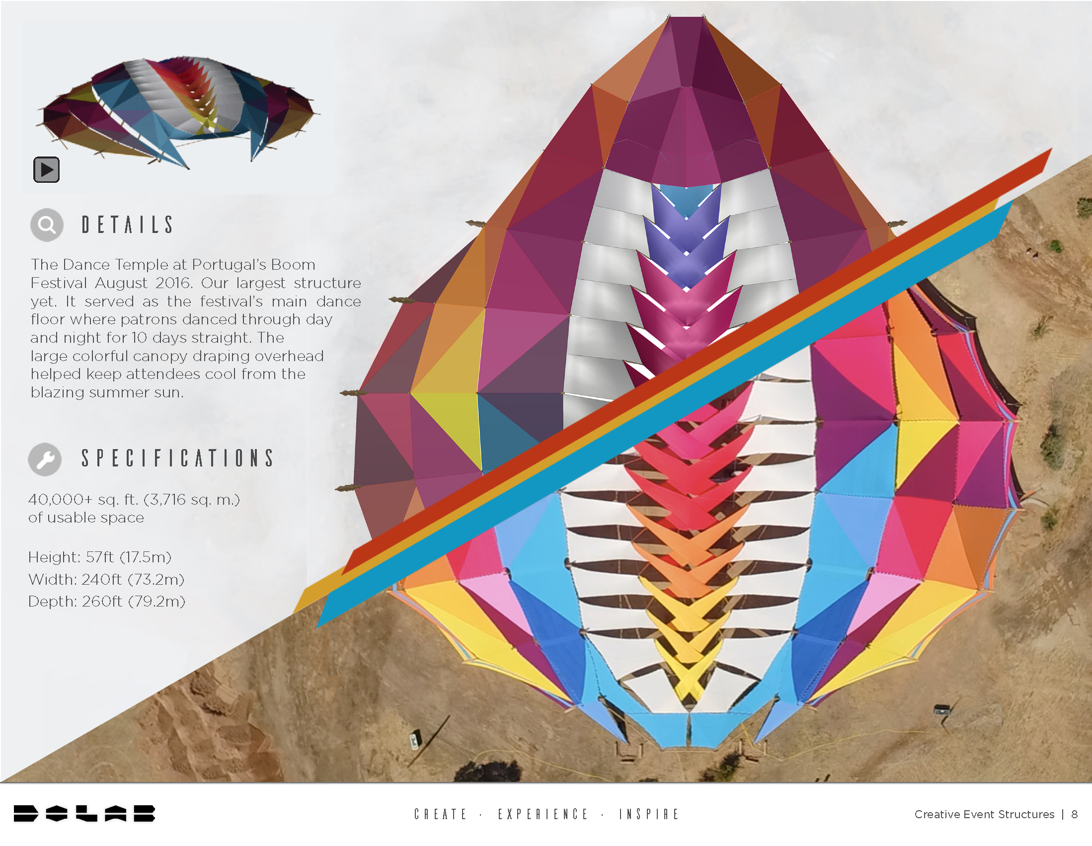
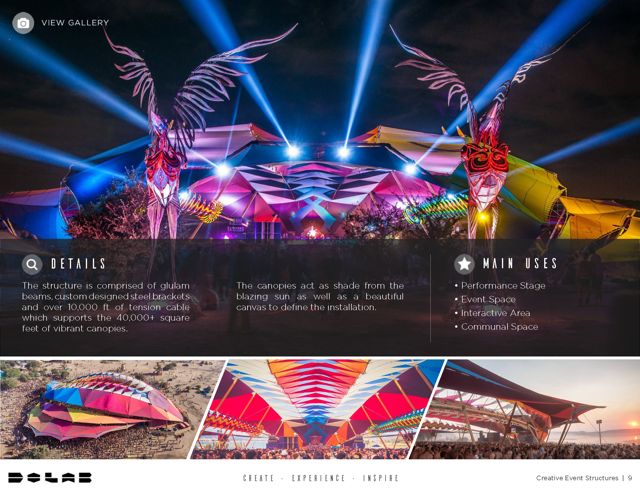
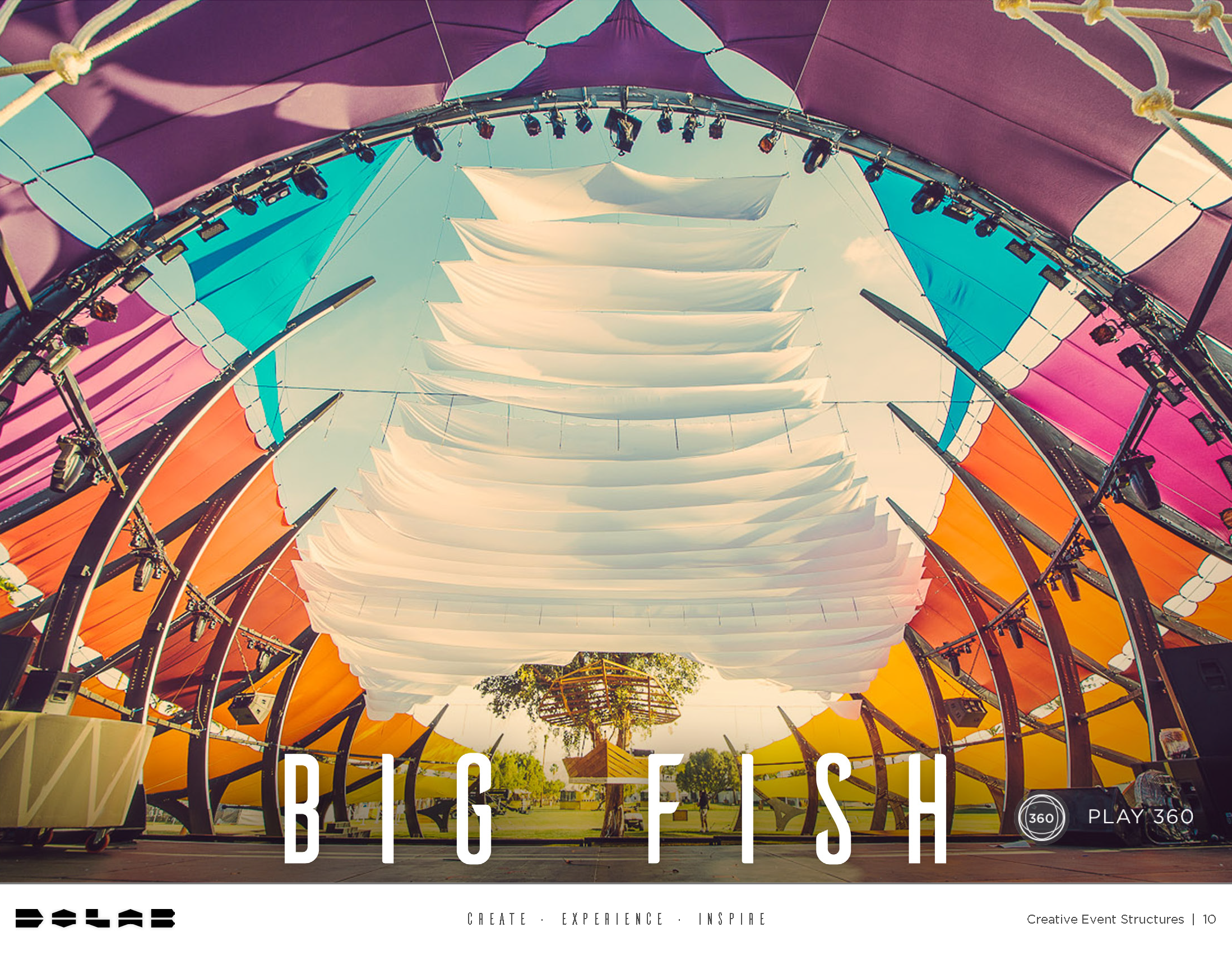
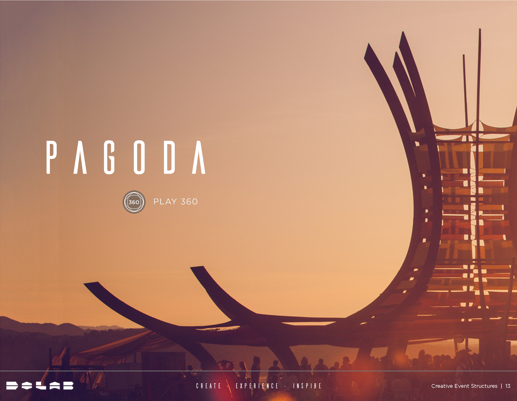
Do LaB - Interactive PDF Book
The Do LaB is an artists collective and event creations company including Lightning in a Bottle Music and Arts Festival. For this project, I was tasked with showcasing the custom structures that are completely designed and manufactured by the Do LaB team. This was sent as promotional material to other promotion companies, event companies, etc. Created in Adobe InDesign.
February 2018
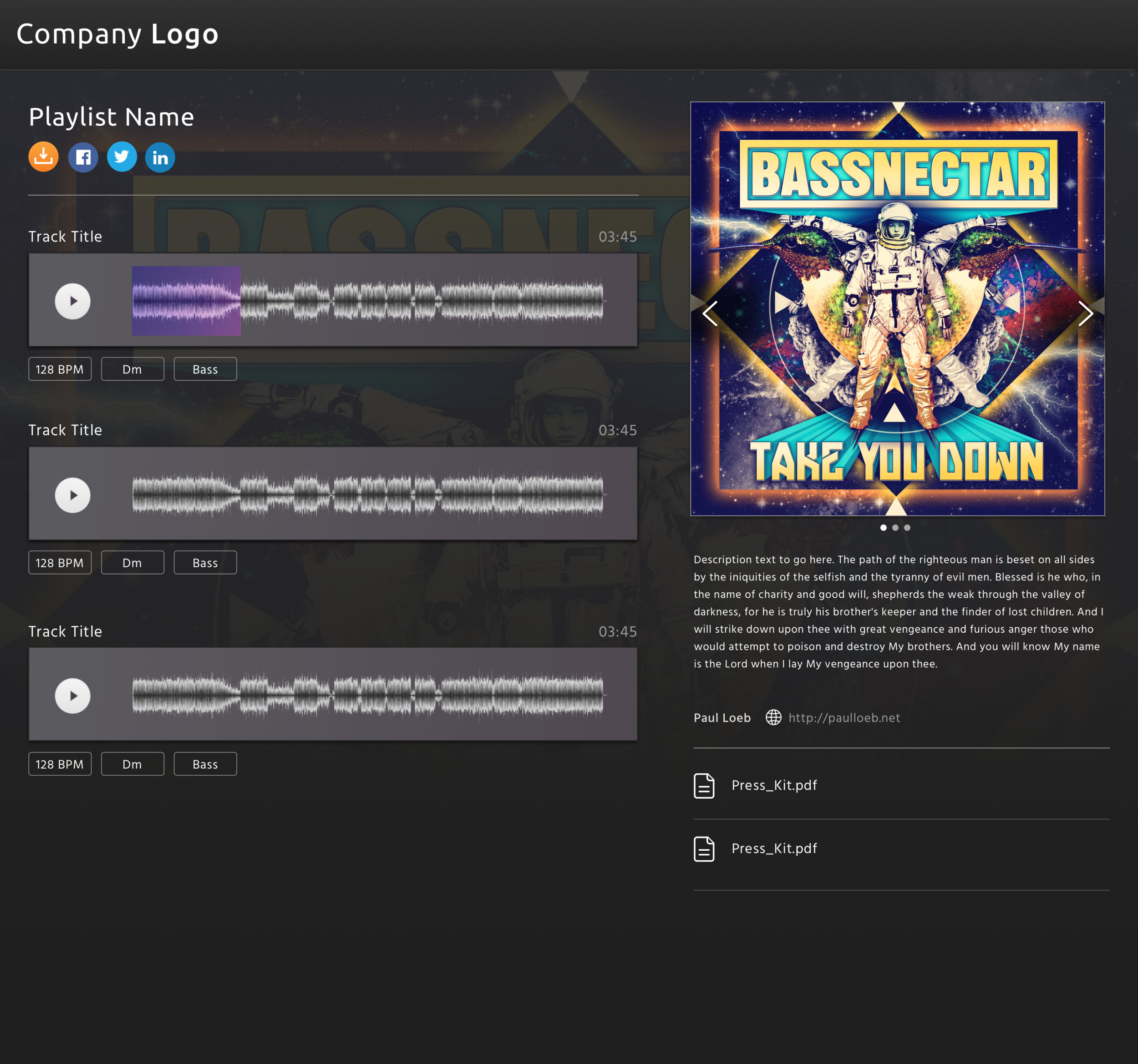
DropTrack
Overview
DropTrack provides music promotion software for record labels. I was tasked to re-skin the bootstrap product and create a professional yet creative aesthetic.
December 2016